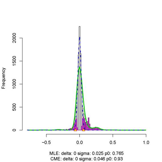
Figure 1. The
plot produced by the locfdr function (from R package locfdr) for the simulated data with 150 genes and 100 samples. The
green curve represents the fitted mixture density (fitted with 15 degrees of
freedom) and the dashed blue line represents the estimated null density.
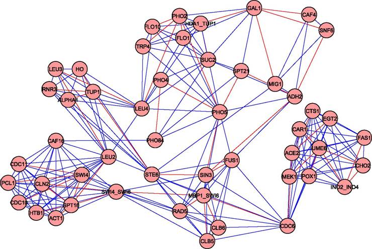
Figure 2. Genetic network reconstructed using the PLS method for the simulated data. It consists of 227 interactions, 50 of which (colored in red) are the "true" interactions.